







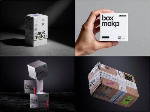
Something about certain product photos makes people scroll past without knowing why. The box looks fine, the label is sharp, and yet it reads as fake. Nine times out of ten, the problem isn’t the design — it’s how the render was built. Zoom in and the tell is usually one of a few repeat offenders: light that doesn’t behave, a surface too clean to be cardboard, or a proportion slightly off from a real box on a table. A Box mockup is supposed to disappear into the background so the packaging design gets all the attention. When it doesn’t, small technical errors are almost always the culprit, and they’re fixable once you know where to look.
Lighting That Doesn’t Match Reality
The fastest way to spoil a mockup is lighting that contradicts itself. A box lit from the left while its shadow falls the same way, or a highlight with no light source to explain it, breaks the illusion instantly. Brands preparing Amazon listing images or Kickstarter photos often paste a render onto a stock background without checking where the light originates. The fix is simple but often skipped: match the direction, softness, and color temperature of the light to the backdrop, and let the shadow fall accordingly.
Flat Surfaces With No Texture
Cardboard has tooth. Coated stock has sheen. Kraft paper has fiber. When a mockup renders every box as a smooth, glassy plane, viewers register it as synthetic even without knowing why. Skincare brands doing pre-launch marketing run into this often — a matte, recycled-paper box rendered with a glossy default material looks like a toy. Before exporting, check that the material settings reflect the actual substrate: subtle grain, a touch of roughness, maybe a faint crease where the box would naturally fold.
Perspective That Fights the Product
A box mockup shot at an aggressive three-quarter angle can hide proportions that don’t exist in the real product. This becomes obvious once a customer receives the physical item and it doesn’t match what they saw online — a common complaint in DTC food and supplement packaging, where exaggerated angles make small boxes look substantial. Straightening the perspective, or keeping it consistent with how the box will sit on a shelf, keeps expectations honest and the render believable.
Getting the Small Details Right
A handful of details separate a convincing render from an obvious fake:
- Edge wear — real boxes pick up faint scuffs at the corners during shipping; a pristine edge on every side reads as CGI.
- Print bleed and registration — colors stopping exactly at the fold line rather than wrapping naturally look printed by software, not a press.
- Consistent scale — a box slightly too large or small for its stated dimensions throws off the whole composition, especially next to other products.
Studios producing packaging comps for cosmetics lines lean on these details constantly, since a missed edge can make a polished label look unfinished on a product page.
Where This Actually Gets Used
Coffee roasters use mockups to test bag designs before committing to a print run, since a physical proof for every variation isn’t practical on a tight budget.
Agencies pitching concepts to a beverage client drop the same label onto several box shapes to show how it reads across formats, well before any carton physically exists.
E-commerce sellers preparing Amazon A+ content rely on the same technique to show a product family — different flavors, sizes — as a cohesive set on a shelf that was never physically built.
Crowdfunding creators on Kickstarter and Indiegogo lean on mockups to show backers what a finished product will look like, long before tooling or a print run is paid for.
In-house teams at CPG companies use them during internal review, holding a rendered box next to a competitor’s real product to judge shelf presence before a single unit is manufactured.
In each case, the render stands in for a photo shoot that would otherwise cost more and take longer, which is exactly why the small technical mistakes matter: they’re the difference between a mockup that reads as a real product shot and one that reads as a placeholder.
Building a Habit, Not Just Fixing One File
None of this requires advanced 3D skills. Most fixes come down to slowing down before export: checking the light source, confirming the material isn’t defaulting to plastic-smooth, and comparing the angle against how the box sits in real life. Design teams that keep a shared library of well-built templates, like the ones at ls.graphics, tend to avoid these issues altogether, since the lighting and material work is already handled at the source. That leaves more time for what matters — making sure the packaging design earns a second look, rather than losing the sale to a render that quietly gave itself away.